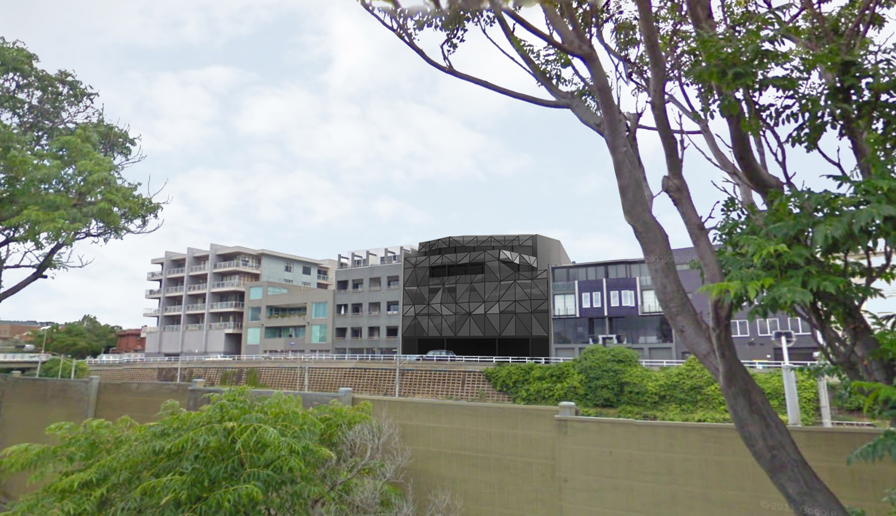


Buzz, an innovative design company, seeks a new Head Office which reflects its philosophy. The commercial development in St. Kilda retains the existing building with the addition of two levels of office space. The profile of the architectural form is volumetric and sculpted to alleviate the massing of the adjoining properties. The form and materiality of the façade provides opportunities to frame the city views while providing efficient shading to the north, creating an optimal working environment within. It was inspired by the ancient art of origami, the works of Ruth Asawa and the form + detail of Buckminster Fuller’s Geodesic Dome.
The design includes four new tenancies at ground floor level with a café fronting onto Wellington Street. The remaining three tenancies would suit smaller ’start-up’ businesses by virtue of their size. The opportunity to support new business practice is seen as a desirable outcome for the building owner.
Levels one to three will be commercial office space for Buzz. Central to the proposal is the creation of comfortable, open plan working environments, which facilitate communication and creativity.
The orientation of the site creates the opportunity to include a double height, north facing winter garden with outdoor terrace areas on levels two and three, both of which overlook the city. These levels incorporate a large central atrium space, which opens out at the roof level. The atrium strengthens both the visual and physical connectivity between each of the floors, allowing for natural light and cross ventilation throughout the space.
The articulation of the Wellington Street façade creates a seamless transition between levels, providing coverage for the ground floor entry and terrace area as well as folding back to minimise the massing to the south west corner.
The facades envisaged will be constructed from steel and clad in three primary materials. There will be two colours and profiles of perforated steel mesh, one dark and the other a bronze. The mesh panels will form the parts of the facade where there is to be natural ventilation and light into the balcony space behind. The different perforations can be alternated to introduce more or less light into the space. A solid metal composite panel will clad the structure behind, provide shading where required, and frame the views.
The simplicity of form and the finely crafted façade translates a series of patterns and shadow play into the space, which changes throughout the day to create a unique working environment. The proposal will be a vibrant and unique component of the St Kilda tapestry, helping to articulate the mixed-use quality of Wellington Street.
